Introduction
Design Blitz is not a challenge but an opportunity to look deeper when observing old photos or taking new ones. Instead of explaining what I see in an image, looking for different concepts helps me understand why I feel the way I do about said images. Finding concepts to further understand images gives a new set of introspection to photography.
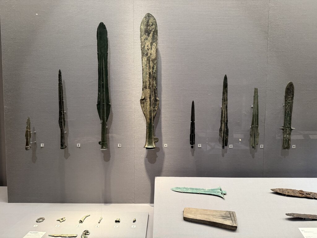
1. Minimalist: Artifact Gallery
For image 1, I went for a minimalist style because of the amount of white space that overtakes the frame. The design of the artifacts being displayed gives emphasis to them without taking away the significance of each one. The design feels clean and formal, like museums normally are. The information palettes explaining the artifact origins are also small, providing information without adding clutter to the area.
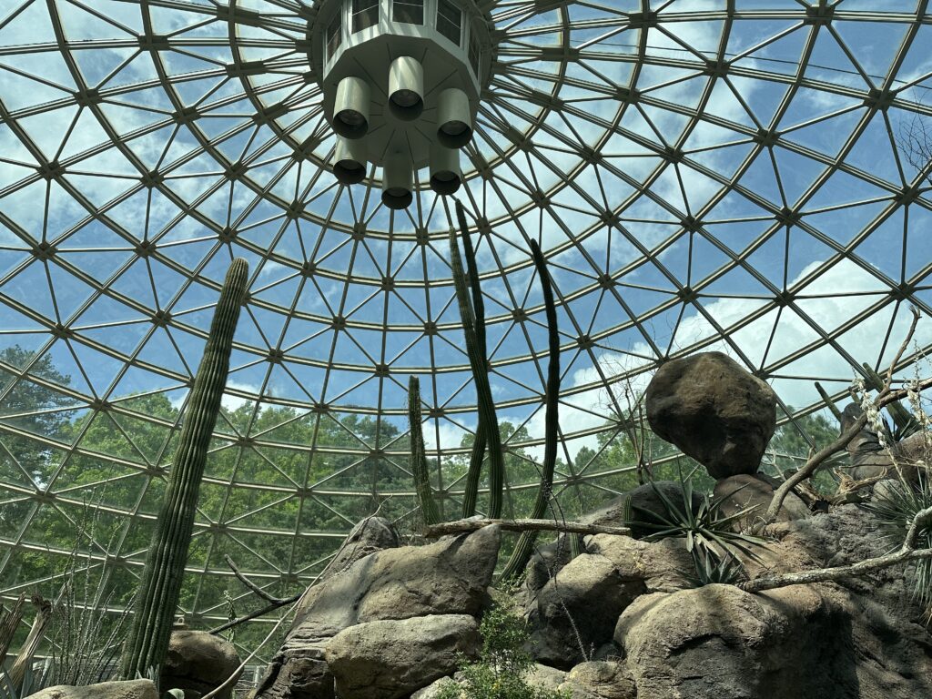
2. Rhythm: Zoo Dome
This picture of a zoo globe represents rhythm. What gave me that conclusion was the repeating patterns of the glass. My eyes track the lines of the design to the center of the dome, giving a central focus to the tubes in the middle and the landscape underneath. The multiple cylinder or shape patterns in the glass added appealing symmetry.
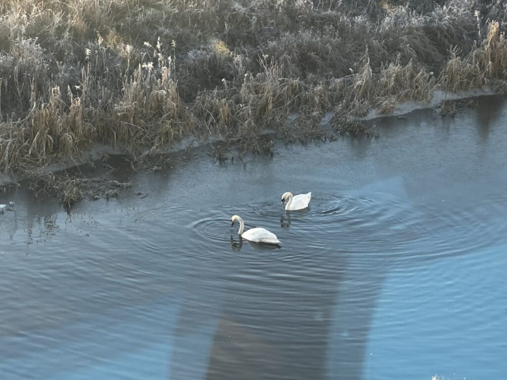
3. Dominance: Lingering Swans
The swans being so minimal yet eye-catching was interesting to me. When I took this photo, I originally observed the beauty of the reflection in the water and how blue it was. After further observation, I enjoyed how the swans fit naturally in the frame whilst complimenting the environment. The swans are integral; I feel it would be empty without them. A simple yet effective element in the frame.
4. Proportion: Chaotic Destruction
This picture of a drawing from an anime tells a story without any explanations. With this image I thought of more proportion but not because the clear size difference. The character being small with the destruction around him tells me, he was the cause of the destruction and how grand it is compared to him. The size of the large buildings engulfing space around the character also highlights how smaller elements influence how larger elements are perceived.

Conclusion
From doing this design blitz, I learned each concept has a role to build a bigger picture. I found it interesting how each image doesn’t have one sole concept to complete it. I feel each element helps sub-elements flourish, including smaller details and the story of an image. I also thought it was fun thinking of concepts when choosing these photos, as I came up with different interpretations of the images than what I had originally.