Eye catching
What stood out for me within this booklet was Massimo’s approach to problem solving. His approach targets perspectives based on facts and coherence. Within the booklet its evident that problem solving comes from intellectual processing instead of trends or any bias. The booklet is not as decorative and instead seems to have a lot of effort sourced to structure and precise information while making it easy to consume. I thought the descriptions used to describe the different artforms was very poetic and the simple pictures as example emphasized the information more than multiple images. I feel like that was intentional so I can search for the details described rather it handed to me.
What was Informative?
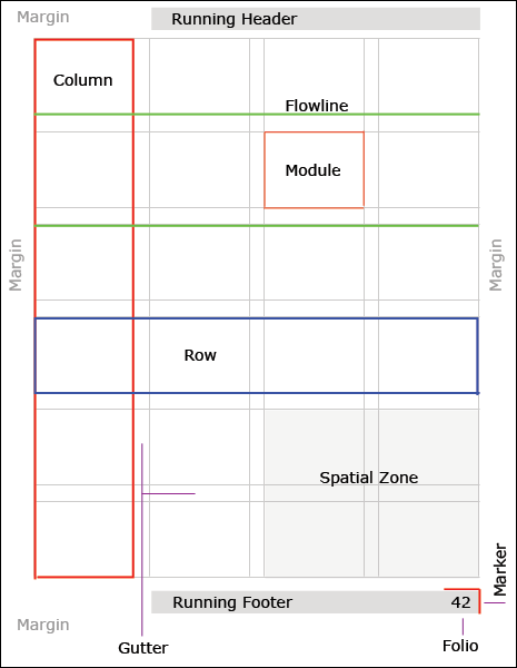
The most informative part of this booklet was the description how the grid system and how it can be used universally. The grid is designed to organize complex information and it is seen as an universal language. The grid can be used to categorize information into sub-sections to help readers choose which information they want to intake. Grids can also reduce visual noise to separate clutter from all navigation pathways. I feel using the grid as a basis whilst explaining other styles makes all information easier to process.
Can I apply this?
I plan to use this structure to add more typographic structure as when I explain information or display my creative processes, its normally cluttered. I aim to explain information more precisely so consumers can understand what I’m explaining properly. I also plan to use white space more intentionally to create a design that catches the eye of the reader whilst not taking away from what’s on screen. Lastly, I want to have writing with a more logical flow to reduce the amount of words with the same type of information to reduce an overload for the reader.
Leave a Reply